TSMS 09.05.01
This new version of TSMS creates more overview, has more functionalities and a greater user-friendliness in the dashboard and TSMS maps. By adjusting the colors in personal settings, you can create a completely new look in the TSMS application. For the complete changelog of 09.05.01 see here.
TSMS maps
A visual representation of your network is shown in TSMS maps. All components are represented by icons, which also show the status. New is that the name of the component will now also be displayed by default and not only when hovering. This makes creating an overview of your network a lot easier, as in the example below.
Click here for an instructional video on how to add components in a folder.
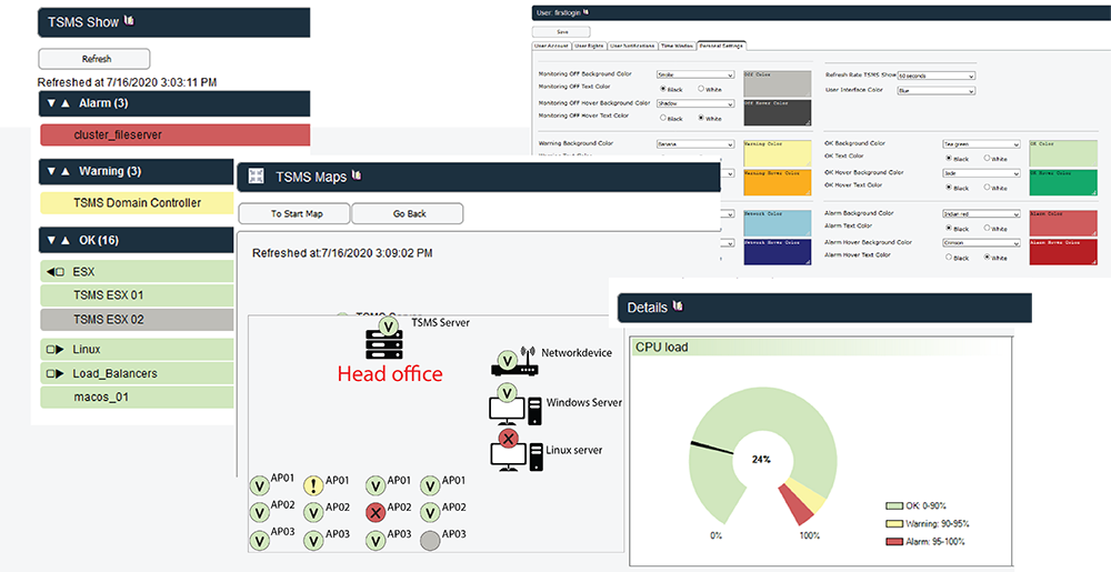
Create your own look in the personal settings
It has always been possible, but we have expanded and adjusted the colors in the personal settings. This allows you to choose your own colors and this is implemented throughout TSMS. For example, the bars in the TSMS show, the icons in TSMS maps and the gauges in the details screen and dashboard will be adjusted in your color scheme.
TSMS Dashboard
The important data of your own environment can be displayed while rotating. But you can also include the website of another tooling, for example. The Dashboard has been developed to create an overview, after which it is easy to zoom in in case of problems. We have expanded this feature at the request of customers. First, the status of (important) network components can now be displayed, this can be the current status or the graph of the past period. If there is literally a hitch in the cable, the graphs immediately indicate this. Another extension is that the TSMS Show, Maps and Notifications pages can be added as dashboard Item.